
BARMER – Optimizing the user journeys by reworking key pages and tailoring them to the specific needs of different target groups.
Challenge
With over 9 million members, BARMER is one of Germany’s largest health insurance providers and a leader in healthcare digitalization. The project faced several challenges, including the lack of a design foundation, unclear user journeys and no clear entry points or calls to action for the different target groups, resulting in navigation confusion. Additionally, the website had to meet the highest standards of usability, accessibility, and data privacy, while also being flexible enough to allow frequent content updates and adjustments by BARMER's internal content team.
Solution
To address the key challenges, it was crucial to establish a solid foundation in the form of a design system. Based on this, we systematically reworked the key pages of the BARMER website.
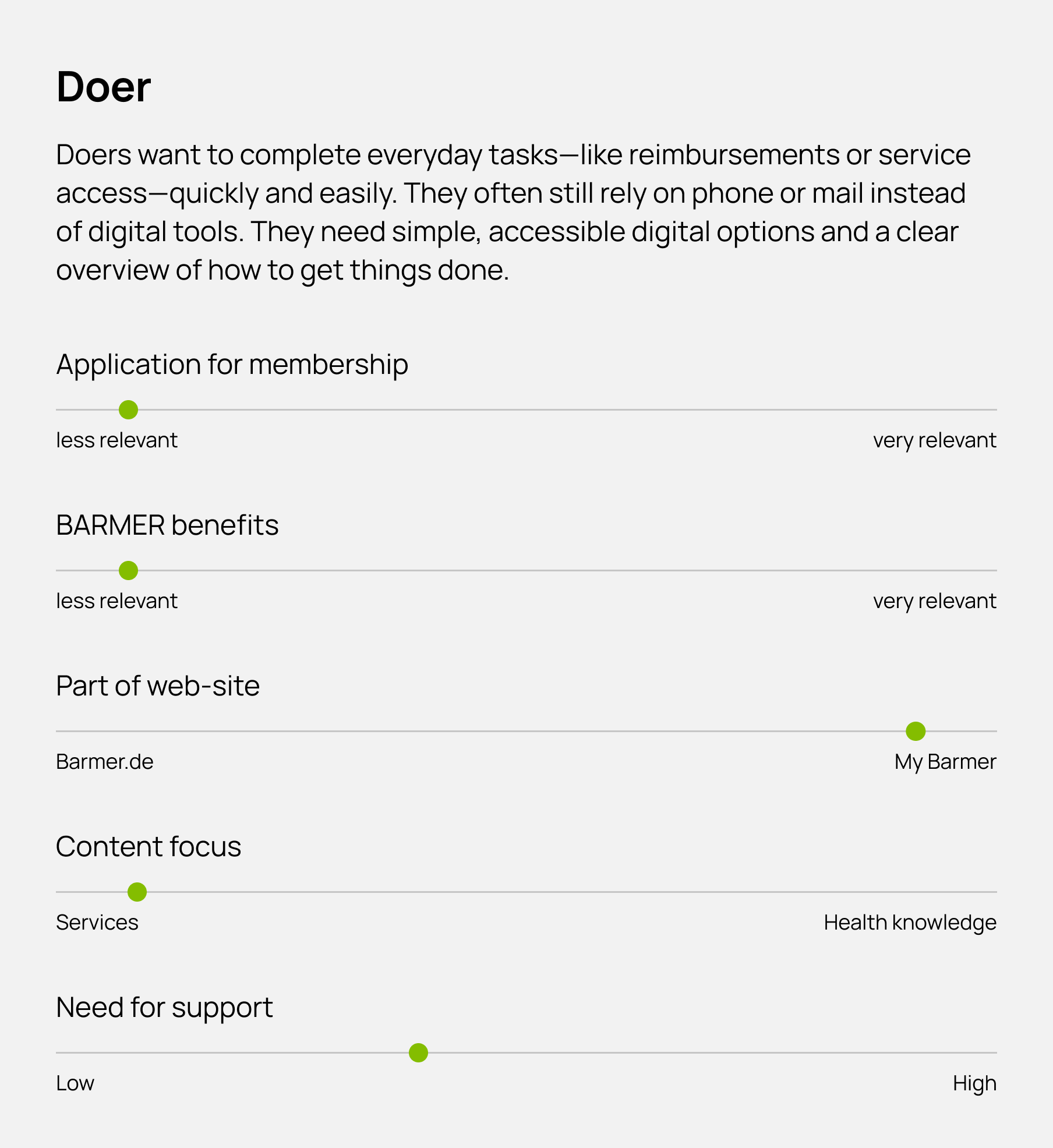
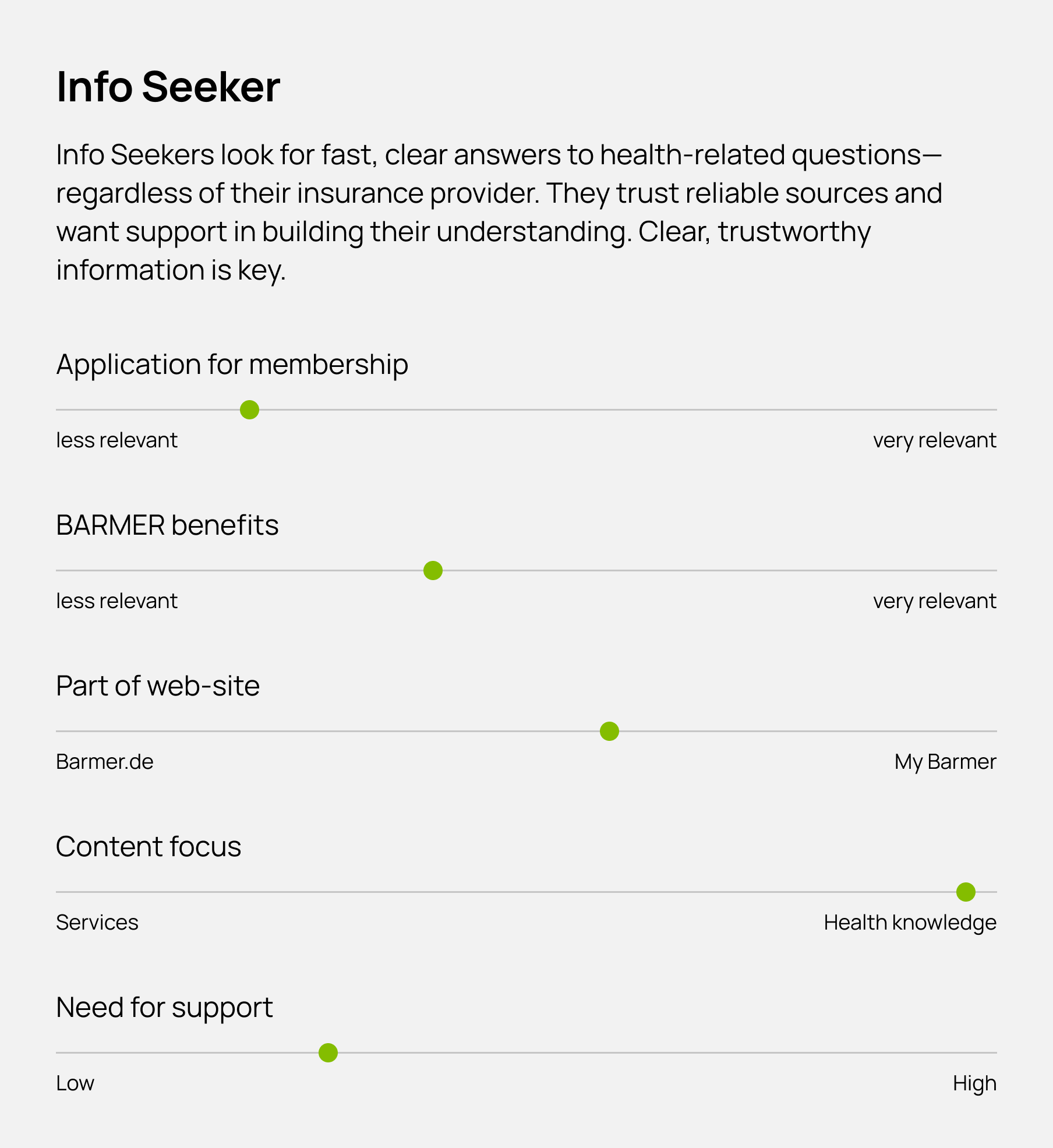
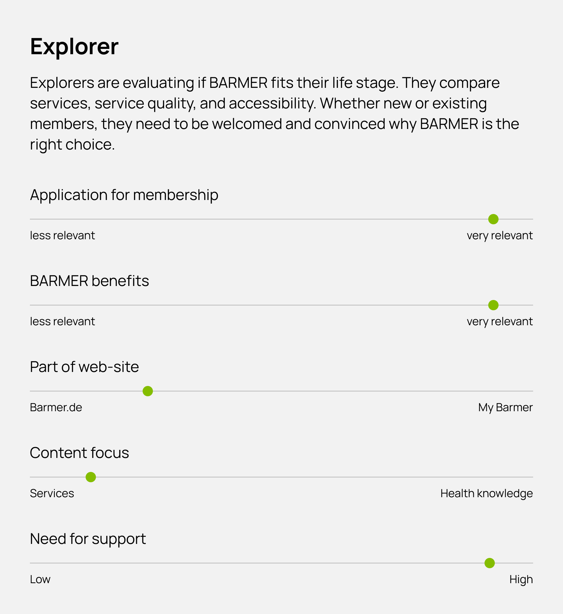
To create a user-centric experience, we followed a structured Design Thinking process, from user research and defining core needs to ideation, prototyping, and testing. Early on, we developed user archetypes based on detailed analysis to reflect the diversity of BARMER’s audience. These archetypes serve as a strategic foundation for all conceptual and design decisions to ensure that the website meets the expectations of different target groups. The focus was on the most visited key pages, including the homepage, product pages, and article pages. We aligned the overall experience with user needs, BARMER’s main KPIs, and technical requirements.
Homepage Template
The template for the BARMER homepage was designed to enhance user navigation through a clear structure while presenting content in an engaging and brand-appropriate way. Based on multiple user interviews and A/B testing, we reduced the amount of text, introduced visual diversity. In addition to that we integrated key entry points to contact options, the BARMER app and various social media channels. The goal was to meet the needs of different target groups while specifically attracting potential new members by providing an emotional entry point, clear benefit communication and memorable brand moments.

Product Page Template
For the product pages, the focus was on highlighting the product’s benefits and building trust. Key features were showcased with visual representations of the app screens to set clear expectations for the users. Additionally, user reviews were integrated to reinforce trust and encourage downloads. To meet users at different stages of their journey, the download options were strategically placed throughout the page.

Article Page Template
During our analysis of the article pages, it became clear that they were too long, overly text-heavy and visually monotonous. While BARMER covers a wide range of topics, the user data showed that the current presentation style made these articles feel less engaging and often led to a quick loss of interest. We identified that different article types, with their distinct requirements, needed tailored article templates, allowing the content team to choose the right presentation approach.
To achieve this, we introduced a slot mechanism within the templates, enabling a more flexible content layout. For complex topics, such as diseases, the focus was on delivering key information in a structured and easily digestible way. Smaller and medium-sized slots were used for elements like images, quotes, or definitions to maintain a smooth reading flow. In contrast, lifestyle topics benefited from a more dynamic, magazine-like layout, with larger slots breaking up the content and making the reading experience more engaging.

© 2025 Johannes Merkt • Imprint